

What is mobile-first indexing? It means Google crawls, reads, and ranks the mobile version of your website as the primary version. Not the desktop version. The mobile one. Whatever your site shows on a phone is what Google treats as the real thing, and the desktop layout is now the understudy nobody calls up.
That is the whole idea in one sentence. If your mobile site is missing content that your desktop site has, Google is grading you on the shorter answer. It does not go looking for the good stuff you hid on the desktop layout. It reads what the phone gets.
Here is the part that trips people up. This is not a penalty, a setting, or something you turn on. It is just how Google works now, for every site, whether you prepared for it or not. So the only real question is whether your mobile version is carrying its weight.
Mobile-first indexing explained without the jargon
For years, Google built its index from the desktop version of a page. That made sense when most searches happened on a computer. Then phones happened. People started searching from the couch, the car line, the checkout counter, and pretty much everywhere except a desk.
So Google flipped the default. Instead of reading the desktop version and hoping the mobile one was close enough, it started reading the mobile version first. Google announced testing back in 2016, rolled it out gradually, and finished the job for the entire web in October 2023. The transition is done. There is no waiting room anymore.
“Mobile-first” does not mean “mobile-only.” Your desktop site still exists and people still use it. It just means the mobile version is the one Google indexes and scores. Google’s own documentation on mobile-first indexing says the same thing in more careful language, but that is the short version.
Why Google made the switch
The reason is not mysterious. Most searches are on phones, so Google decided to see your site the way most people already do.
Think about it from Google’s side. Its job is to send searchers to pages that will actually be useful. If most of those searchers are on a phone, ranking a page based on a desktop layout they will never see is a strange way to make that decision. Google would be judging the version of your site the fewest people experience.
So it stopped guessing. It reads the mobile version because the mobile version is what real people get. That is a rare case of a Google decision that is easy to explain out loud.
Mobile-first indexing versus mobile-friendly

People mix these two up constantly, and the confusion causes real mistakes. They are related, but they are not the same thing.
Mobile-friendly is about the experience. Does the page work well on a phone? Is the text readable without pinching? Are the buttons big enough to tap without a stylus and a prayer? Do choices like a sticky header keep navigation in reach instead of forcing a scroll back to the top? That is a quality question about your visitors.
Mobile-first indexing is about which version Google reads. It is a process question about the crawler. Google now uses your mobile version to build its index, full stop.
Here is why the difference matters. A site can be perfectly mobile-friendly and still lose under mobile-first indexing. How? The mobile version looks great but quietly drops half the content, the structured data, or the internal links that the desktop version had. It feels fine to a human thumb. It reads as thin to Google. Pretty is not the same as complete.
| Mobile-friendly | Mobile-first indexing | |
|---|---|---|
| What it is | A quality standard for the phone experience | How Google crawls and indexes your site |
| The question it answers | Is this page easy to use on a phone? | Which version does Google read and rank? |
| Who it is for | Your visitors | Googlebot |
| How you fail it | Tiny text, cramped buttons, slow load | Mobile version missing content, links, or schema |
| Is it optional | It is a ranking factor, so no | It is the default for every site, so no |
The takeaway: being mobile-friendly is necessary, but it does not automatically mean your mobile version is complete enough to rank well. You need both. A nice-looking phone page that says less than the desktop page is a very tidy way to rank lower.
Does mobile-first indexing affect rankings
Short answer: yes, but not the way people fear.
Mobile-first indexing is not a ranking factor you can win or lose points on. Google is not adding or subtracting based on it. It is simply the version Google evaluates. The ranking impact is indirect, and it comes entirely from one thing: what your mobile version actually contains.
If your mobile version has the same content, the same headings, the same structured data, and the same links as your desktop version, mobile-first indexing changes nothing for you. You were already showing Google the full picture. Nice work, carry on.
The businesses that got burned are the ones who treated mobile as a stripped-down afterthought. They shipped a lightweight phone version with less text, fewer links, and no schema, figuring desktop was the “real” site. Then Google started reading the light version and ranking it accordingly. The content they were proud of never got counted, because Google was reading the pocket-sized edition.
So it affects rankings the same way a test affects your grade. The test did not lower your score. Studying half the material did.
How to optimize for mobile-first indexing
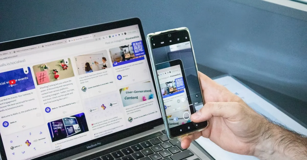
The whole game is parity. Your mobile version and your desktop version should tell Google the same story. Here is where that actually matters.
Serve the same content on both. This is the big one. Same body text, same headings, same images, same videos. If your desktop page explains something in four paragraphs, the mobile page should not quietly trim it to one. Collapsing content behind tabs or accordions is fine, since Google reads content that is in the HTML even if it is hidden behind a tap. Deleting it is not fine.
Keep the structured data identical. If you have schema markup on desktop, it needs to be on mobile too. Google reads schema from the mobile version now, so leaving it off the phone layout means Google never sees it. Schema is not decoration. It is how you tell Google what the page actually is, and it only counts if it is on the version being read.
Match your metadata. Titles, meta descriptions, and robots tags should be the same across both versions. A noindex tag that sneaks onto only the mobile template is a quiet way to disappear from search, and those are miserable to diagnose after the fact.
Do not block your own resources. Let Googlebot crawl the CSS, JavaScript, and images the mobile page needs to render. If your robots.txt blocks the files that make the mobile page work, Google sees a broken version and judges it on that. It is like inviting someone for dinner and locking the kitchen.
Keep the internal links intact. Mobile menus love to hide links to save space. That is fine for humans, but the links still need to exist in the HTML so Google can follow them. Fewer links on mobile means fewer paths for Google to crawl your site.
Make it fast and usable anyway. Mobile-first indexing is about which version gets read, but speed and usability still matter for ranking on their own. A slow, cramped page loses whether or not we are talking about indexing. Compressing your images into a modern format like WebP is one of the easiest speed wins on a phone. This is where general technical SEO fundamentals and a genuinely SEO-friendly website design do the heavy lifting.
The cleanest way to get all of this right is a single responsive site: one set of HTML that adapts to screen size instead of a separate mobile URL with its own rules to keep in sync. It is also the setup Google recommends. One version to maintain means one version to get right, which is a lot harder to accidentally break. It is the approach we build into every website we design, because a responsive, crawlable site is one less thing to babysit.
Your mobile-first indexing checklist
If you want the short, do-this-now version, here it is. Run down the list and be honest with yourself.
- Same content on mobile and desktop. Text, images, and video all present on the phone version.
- Same structured data on both. Schema on desktop is also on mobile.
- Same titles and meta descriptions. No mismatched or missing tags.
- No accidental
noindexon the mobile template. Check it directly. - Resources are crawlable. Robots.txt is not blocking CSS, JS, or images.
- Internal links exist in the mobile HTML. Even if the menu hides them visually.
- The page loads fast on a real phone. Not just on your office wifi.
- Buttons and text are usable. Tap targets are big enough, text is readable.
If you can check every box, mobile-first indexing is a non-event for you, which is exactly what you want. If a few boxes are empty, those are your next tasks. This is the kind of thing a proper website audit is built to catch before it costs you rankings.
How to check what Google actually sees
You do not have to guess. A few free tools show you the mobile version through Google’s eyes.
Google Search Console is the first stop. Its URL Inspection tool shows you the crawled page as Googlebot renders it, so you can confirm your content is actually there on the mobile version. Its crawl stats also confirm Google is using the smartphone crawler on your site, which by now it is.
PageSpeed Insights grades your mobile page for speed and Core Web Vitals, using real-world data where it has it. It is the honest mirror for how your page performs on a phone, not on your development machine with a fast connection and low expectations.
Between those two, you can see both what Google reads and how fast it loads. Real data beats opinions, even confident ones. Check before you assume.
One honest note on timing
Fixing your mobile version does not move rankings overnight. Google has to recrawl the pages, reprocess the content, and re-evaluate the site. That takes time, the same way all SEO does.
At the bare minimum, give any SEO or content work three months before judging results. Honestly, more time is better. SEO is not a vending machine. You do not fix your mobile schema and get a lead before lunch. What you get is a site that finally shows Google the full version instead of the pocket edition, and that is the foundation everything else sits on.
Frequently asked questions
What is mobile-first indexing in simple terms?
It means Google uses the mobile version of your website as the main version for crawling, indexing, and ranking. Whatever your site shows on a phone is what Google treats as the real page. The desktop version is no longer the one being scored.
Is mobile-first indexing the same as mobile-friendly?
No. Mobile-friendly is about whether the page is easy to use on a phone, like readable text and tappable buttons. Mobile-first indexing is about which version Google reads and ranks. A site can be mobile-friendly and still lose ground if its mobile version is missing content the desktop version has.
Does mobile-first indexing hurt my rankings?
Not by itself. It only affects rankings based on what your mobile version contains. If your mobile version has the same content, links, and structured data as desktop, nothing changes. If it is a stripped-down version, Google ranks that thinner version, which is where sites get hurt.
Do I need a separate mobile website?
No, and a separate mobile URL usually causes more problems than it solves because you have to keep two versions in sync. A single responsive site that adapts to screen size is simpler to maintain and is the setup Google recommends for mobile-first indexing.
What happens if my content is hidden on mobile?
Content hidden behind tabs, accordions, or “read more” toggles still counts, as long as it is in the page’s HTML. Google reads it even when it is collapsed. The problem is only when content is deleted from the mobile version entirely, because then Google never sees it.
How do I check if my site is ready for mobile-first indexing?
Use the URL Inspection tool in Google Search Console to see the page as Googlebot renders it on mobile, and confirm your content, links, and structured data are all present. Then run the page through PageSpeed Insights to check mobile speed and usability. Both tools are free.
Is mobile-first indexing still rolling out?
No. Google finished rolling out mobile-first indexing to the entire web in October 2023. Every site is now indexed based on its mobile version, so it is not something you can opt into or out of. It is simply how Google works today.
How long until fixing my mobile site improves rankings?
Give it at least three months, and more time is better. Google has to recrawl and re-evaluate your pages after changes, and search results move slowly on purpose. Fixing mobile parity is foundational work, not an instant switch.
The short version
Mobile-first indexing is not a trend to react to. It is the current reality: Google reads your mobile version and ranks you on it. The businesses that struggle are the ones whose phone version says less than their desktop version, and they usually do not know it until the traffic quietly slides.
The fix is parity. Same content, same schema, same links, same story on every screen. If you are not sure where your site stands, run a free audit and see what Google is actually reading. Better to find the gap yourself than to let your rankings find it first.