

A hero section is the area at the very top of a web page that a visitor sees first, before they scroll anything. It usually holds four things: a headline, a short subhead, one primary visual, and one call to action. That is the whole job. It tells someone what you do, why it matters, and what to do next, all in the space that loads before a thumb ever moves.
Most people never scroll far enough to change their mind. So the hero section is where the page either earns attention or quietly loses it. The good news is that it is not complicated. It only feels hard because a lot of them try to say everything at once, and end up saying nothing with confidence.
A hero section is the first thing a visitor sees
The name comes from design, not comic books. The “hero” is the large, prominent block at the top of a page, the star of the first screen. On a laptop it is what fills the browser window before scrolling. On a phone it is roughly the first screen and a half.
You will also hear the phrase “above the fold.” That is borrowed from newspapers, where the important story sat above the physical fold so it showed on the rack. Same idea online. Whatever sits above the fold is the part everyone sees. Whatever sits below it is the part you hope they get to.
For a local or service business, the hero section is doing the work a good salesperson would do in the first ten seconds. Your homepage is not a business card. It is a salesperson. The hero is that salesperson’s opening line, and “we provide solutions” is not an opening line. It is a sentence in a witness protection program.
What actually goes in a hero section
Strip away the trends and a strong hero section is four parts. Not seven. Four.
| Element | What it does | Keep it to |
|---|---|---|
| Headline | Says what you do and who it is for | One clear sentence, usually the H1 |
| Subhead | Adds the detail the headline left out | One or two lines |
| Primary visual | Shows the work, product, or place | One image or short video |
| Call to action | Tells the visitor the next step | One primary button |
Notice the word “one” doing a lot of heavy lifting. One headline. One visual. One primary action. A hero section with three competing buttons is not giving the visitor options. It is giving them a decision they did not ask to make, at the exact moment you wanted them moving forward.
You can add a trust signal if you have a real one, like a review count or a recognizable client. Do not invent one. A fake logo wall is a great way to look established and dishonest at the same time.
What makes a hero section work
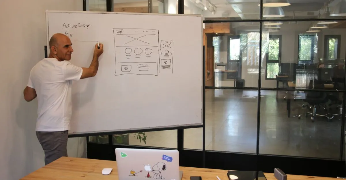
A good hero section answers one question fast: am I in the right place? If a visitor cannot tell what you do and who you help, the design does not matter. A confusing website does not create curiosity. It creates a back button.
Three things separate a hero section that works from one that just looks nice.
A clear value proposition. Say what you do in plain words. “Emergency plumbing in Nashville, same day” beats “Reimagining the water experience” every time. Clever headlines are risky. Clear headlines pay rent. The first few seconds decide whether someone stays, and nobody stays to decode a riddle.
One primary action. Decide the single thing you most want a visitor to do. Book a call. Get a quote. Request an audit. Then make that the obvious button. Everything else is secondary. If the goal of your hero is unclear to you, it will be a mystery to the customer, and mysteries do not convert.
A fast, relevant visual. The image should show the real work, the product, or the place, not a stock handshake in a boardroom nobody has ever visited. It also has to load quickly, which matters more than most people think. We will get to why in a second. This is where thoughtful web design earns its keep, and it is a big reason web design is not just decoration.
Hero image vs hero section, because people mix them up
Quick clarification, since the two terms get swapped constantly. The hero section is the whole top-of-page block: headline, subhead, visual, and button together. The hero image is just the visual inside it, the large graphic or background photo.
So every hero image lives inside a hero section, but a hero section is more than its image. Plenty of strong hero sections use a small product shot or no photo at all, just bold type and a button. The image supports the message. It is not supposed to be the message.
Your hero section usually holds your H1
Here is the part most design articles skip, and it is the part I care about most.
The headline in your hero section is almost always your page’s H1, the single most important heading on the page. Google leans on the H1 and your heading structure to understand what a page is about. Google’s own SEO guidance on page structure treats clear, descriptive headings as a basic signal, not a nice-to-have. A vague hero headline is a vague H1, and a vague H1 makes Google guess. Do not make Google solve a puzzle.
So a good hero headline does two jobs at once. It tells a human what you do, and it tells a search engine what the page is about. Write it for the person first, then check that it still reads clearly with your main keyword in it. That overlap between clear copy and search signals is the whole point of SEO-friendly website design, and it starts at the top of the page. If you want the deeper version of this for your main page, we broke it down in homepage SEO tips.
The hero image is often your LCP element

There is a second technical reason to care about the hero, and it lives in Core Web Vitals.
Largest Contentful Paint, or LCP, measures how long it takes for the biggest visible element to load. On most pages, that biggest element is the hero image. Google’s team at web.dev explains LCP as a core measure of loading experience, and a slow one drags down the whole page’s perceived speed.
So a giant, uncompressed hero image is not just slow. It is slow at the exact spot Google is measuring, on the first screen every visitor loads. Compress it, size it correctly, and serve a modern format. The web.dev guide to optimizing LCP walks through the specifics. Pretty is not the same as fast, and Google keeps score.
This is also why I am not a fan of dropping a 4MB background video into a hero just because it looks impressive in the demo. It looks impressive right up until it costs you the visitor you were trying to impress.
Common hero section mistakes on service business sites
Most of the hero sections I audit are not broken. They are just unclear or slow. A few patterns show up over and over.
- The mystery headline. Something clever that could describe a law firm, a bakery, or a SaaS startup. If it fits every business, it says nothing about yours.
- Too many buttons. Three equal calls to action means no call to action. Pick the one that matters.
- A slow, oversized image. Beautiful, enormous, and single-handedly wrecking your LCP.
- Copy written for the founder, not the customer. Your customer does not care that you are “passionate about excellence.” They care whether you fix the thing they searched for.
None of these need a redesign. They need a clearer headline, one honest button, and an image that loads before lunch.
Frequently asked questions
What is a hero section on a website?
A hero section is the block at the very top of a web page, above the fold, that a visitor sees before scrolling. It usually contains a headline, a short subhead, one main visual, and one primary call to action. Its job is to tell someone what you do and what to do next, fast.
What is the difference between a hero image and a hero section?
The hero section is the entire top-of-page block, including the headline, subhead, visual, and button. The hero image is only the large graphic or background photo inside that block. Every hero image sits inside a hero section, but the section is more than the image.
Does every page need a hero section?
Most homepages, landing pages, and service pages benefit from one, because those pages need to orient a visitor quickly. Deeper pages like blog posts or documentation often do not, since the reader already knows what they came for. Use a hero where a strong first impression changes what the visitor does next.
What makes a good hero section?
A clear value proposition, one primary call to action, and a fast, relevant visual. If a visitor can tell what you do and who you help within the first few seconds, and they know the next step, the hero is working. Clarity beats clever, and speed beats spectacle.
How does a hero section affect SEO?
The hero headline is usually the page’s H1, which helps search engines understand what the page is about. The hero image is also often the Largest Contentful Paint element, so its file size directly affects your Core Web Vitals. A clear, fast hero helps both rankings and user experience.
How long should hero section copy be?
Short. One headline sentence and one or two lines of subhead is plenty. The hero is meant to be scanned in seconds, not read like a paragraph. If you need more room to explain, that content belongs further down the page, not crammed above the fold.
Should a hero section use an image or a video?
Either can work, but the file has to load fast. A well-compressed image is the safe default. Video can add energy, but a heavy autoplay video often hurts your load time and Core Web Vitals more than it helps. If you use video, keep it short, compressed, and optional.
Start with a hero that says something
A hero section is not a decoration. It is the first thing your visitor reads, the home of your H1, and usually the largest thing your page has to load. Get the headline clear, keep it to one primary action, and make the visual fast. Do that and you have handled the part of the page that most visitors will ever actually see.
If you are not sure whether your hero is helping or quietly costing you customers, run a free audit and see how your top-of-page holds up on clarity and speed. Fix the top of the page first. The rest is easier once the opening line lands.